Creepy twins, mime artists and pickle monsters: behind the scenes of our Kyiv ad shoot
We’ve made some big changes at Whereby recently. Like free 100-person rooms for all users, new pricing for Pro and Business plans, and free trials for all our plans – with no credit required. Not to mention a whole lot of spring cleaning across our website.
To celebrate, we thought it was about time we made our first advert, so we called up our pals at Lucky Generals to see if they could help. They’ve previously made award-winning ads for huge companies like Amazon and we knew they’d knock it out of the park.
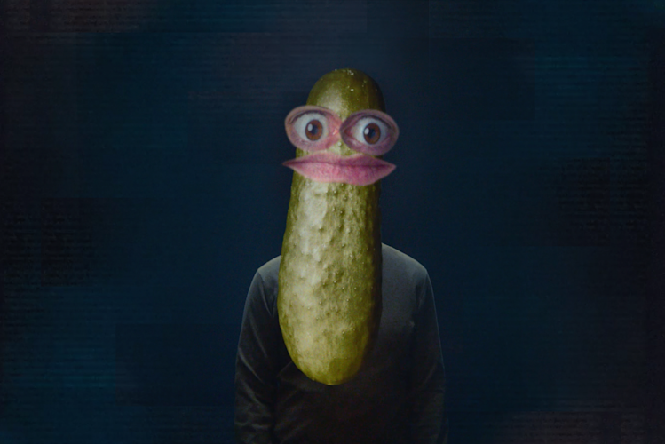
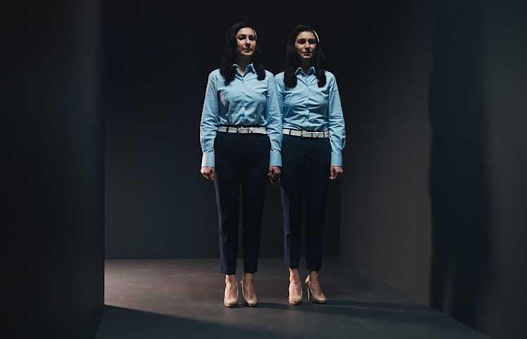
The end result is a trippy journey through dodgy internet connections, pixelated faces, creepy twins that’d give Stephen King the heebie-jeebies, a mime artist who’s perfected the art of the withering look… and a pickle monster.
We sat down for a chat with two of the Lucky Generals crew that helped to bring this nightmare to life – creative director, Charlie Hurst, and strategist, Matt Gainsford – so that we could take a sneak peek inside their brains.
Searching for the truth
“The first thing we looked at was the strapline. We wanted to have a firm idea of what the brand stood for,” says Matt Gainsford, strategist at Lucky Generals. “In the end, we landed on ‘where better meetings happen’.
It works linguistically, because it incorporates part of the brand name. But it also roots Whereby and explains that it’s an actual place where better meetings happen. Whereby rooms aren’t randomly generated – they’re always a specific place you enter.”
For Charlie Hurst, creative director at Lucky Generals, this strapline is the simple ‘truth’ at the heart of the campaign. “Over the past year we’ve all been stuck on calls, with back to back meetings on Zoom, Google, Skype, and more. And none of those services are very good. Whereby offers an alternative – a way out to a better place.”
The challenge was communicating that truth in a 30-second advert. “Rather than simply showing people enjoying good meetings, we wanted to represent the nightmare that lots of people are living through,” says Matt. “The advert demonstrates empathy for people’s situation, then presents Whereby as the answer, without showing all its features.”

Finding inspiration
“We wanted every scene to be something people could relate to,” says Charlie. “There have been loads of news items about people struggling with filters, like the Texas lawyer who got stuck as a cat. We were inspired by all those moments – and that’s how pickle guy came to life.”
As for the other characters in the ad, Charlie took inspiration from far and wide. “The creepy twins were inspired by Stanley Kubrick’s ‘The Shining’. And, like the mime artist, I still do the mime every single day! I’m constantly on mute and don’t realise it’s happened.”
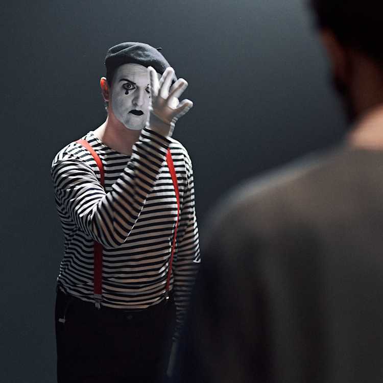
While the ad definitely guarantees a few LOLs, it speaks to some serious issues that people have faced in our new remote-first world. As Charlie says, “The idea for the woman with the tropical background came from a teacher who couldn’t get rid of her novelty background while giving a super serious talk to her students. It’s a problem lots of people have, and it can have some terrible consequences.”
“The film mirrors the traumatising everyday horrors we’ve all experienced in video meetings, from minor glitches to complete technical meltdowns that leave us frustrated and ever so slightly sweaty. At those times we’ve all wished we had a secret door to save us from the nightmare.”
Shooting remotely in Kyiv
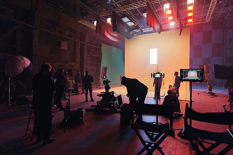
One of the big challenges with the campaign was shooting the advert remotely. The Lucky Generals team is based in the UK, Whereby’s based all over the world, and the ad was made in Kyiv, Ukraine. Thankfully, it wasn’t Lucky Generals’ first rodeo. Or remote video shoot, rather.

“A remote shoot is a pretty new experience for us but it’s something we’ve had to get better at during Covid,” says Matt. “We’ve done a few remote shoots over the past year and made some mistakes, but we’d learned a lot by the time of the Whereby shoot.”
“It was a pleasure working with the whole team to bring this concept to life. Visualizing common online frustrations is always a challenge, but here we found that a minimalistic aesthetic really helped us highlight each of these nightmare-ish moments. It really can feel like a horror show with some of these video call apps. To the point that it can seem like a joke. So, my hope is that we created something relatable, with an interesting aesthetic that makes people question their current video conferencing choice. Or have an existential crisis. Either one.”
Thankfully, everything went okay. And – spoiler alert! – our embattled protagonist in the advert managed to find his way to better meetings. With the help of Whereby, naturally.

Ready to experience better meetings? Try Whereby for free today.
